Back to Work
UX Design
Systems Design
Mobile
Desktop
E-Commerce

OMOC

Social Commerce Platform

I applied to redesign a few screens. Nine months later, I'd designed both sides of a social commerce platform.

Role

UX/UI Designer (Freelance)

Duration

April – December 2025

Platform

Web (Seller) + Mobile (Buyer)

Team

Founder, 2 Developers, Me

9

Months

100+

Screens

6

Feature Areas

2

Platforms

PROCESS

My UX Workflow: AI as a Design Thinking Tool

Claude didn't replace my design thinking; it let me validate UX decisions faster. The research, the 'why,' the system mapping: that's me. The rapid prototyping: that's where AI accelerated the process.

01

Receive task

From founder via WhatsApp

02

Clarify

Discuss with Claude if unclear

03

Research

Etsy, Shopify, Instagram patterns

04

Prototype

Build full flow in Claude artifacts

05

Present

Screenshot artifact → founder feedback

06

Iterate

Refine artifact based on discussion

07

Design

Move to Figma with OMOC design system

08

Polish

Final iterations in Figma with founder

MOMENT 01

Navigating ambiguity when requirements fundamentally change
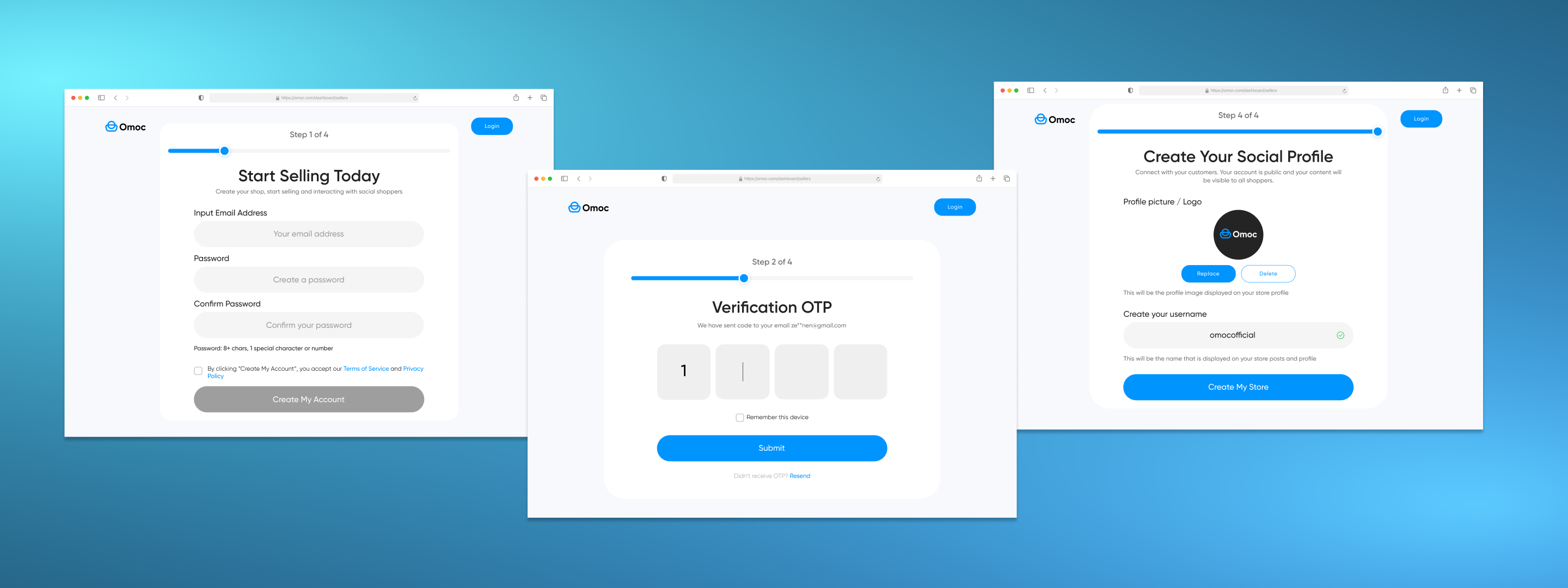
Seller Onboarding

A signup form became a compliance system

What started as a 4-step signup became a 7-step EU compliance system spanning three entity types. The founder sent a PDF that transformed everything.

BEFORE

4 generic steps: email, OTP, store name, profile picture. Wrong input components that didn't match the design system. No compliance handling.

AFTER

7 contextual steps with entity-type classification (individual / sole proprietor / company), progressive disclosure per type, real-time VIES validation with 3 states, and design-system-consistent components.

OMOC original onboarding flow with basic signup fields

1 / 4

Original 4-step signup

Used the founder's PDF spec as a starting point, then built complete flows in Claude artifacts before touching Figma

Applied progressive disclosure: classify the seller first, then surface only relevant fields per entity type (individual vs. sole proprietor vs. company)

Designed a country selector component from scratch and added it to the design system, reusing the dropdown pattern

Created three VIES validation states: validating (spinner), success (checkmark), error with recovery path

Fixed accessibility issues with input fields the previous design had wrong, going beyond the brief

WHAT THIS SHOWS

I can take ambiguous, expanding requirements and create structured, logical flows. I fix what's broken even when it's not in the brief.

MOMENT 02

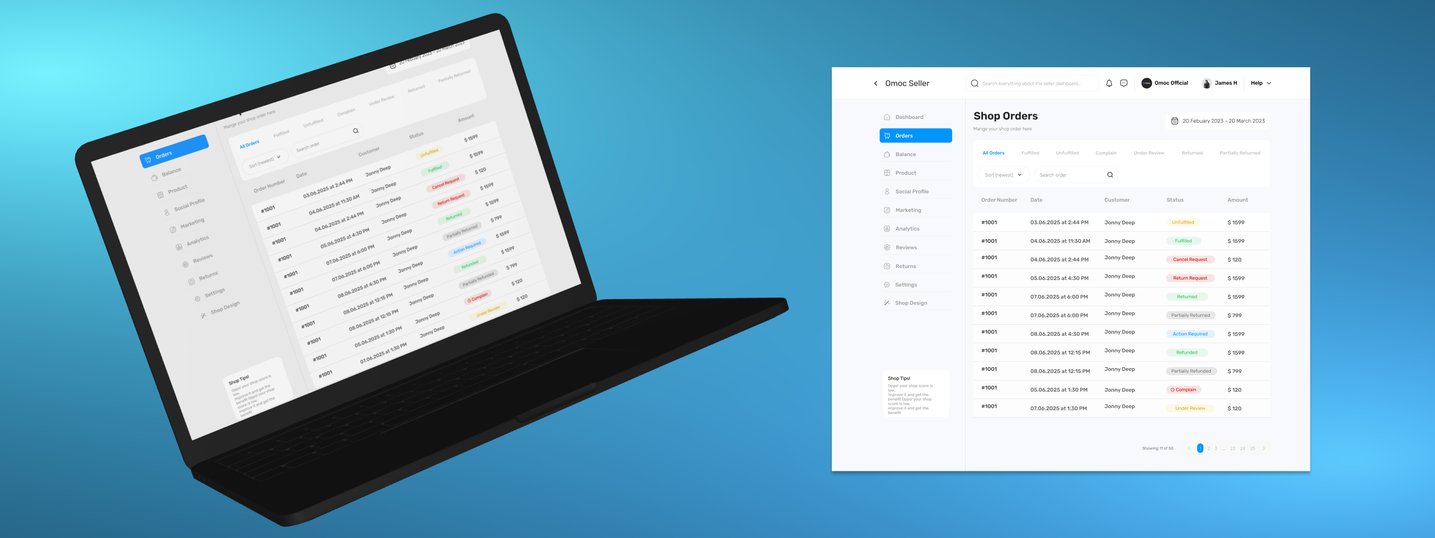
Systems thinking: every screen on one side has consequences on the other

Order Management

Designing how orders flow between two sides of a marketplace

The biggest piece of work in the project. Nothing existed. I designed the seller dashboard with 11+ statuses AND the buyer-side cancel/return/complain flows, simultaneously.

BEFORE

No order management system at all. No dashboard, no status tracking, no buyer-side order actions.

AFTER

Full seller dashboard with 11+ order statuses, buyer item-level selection for cancel/return/complain, and chat-based complaint resolution.

OMOC seller dashboard showing all order statuses

1 / 4

Seller order dashboard with 11+ statuses

Deeply researched how Etsy and Shopify handle every order status from both seller and buyer perspectives

Designed the seller dashboard first, mapping all statuses and flows, then traced how each buyer action creates a seller-side status change

For buyer cancellation: created item-by-item selection (not abstract 'full vs partial'), made it clear you're requesting, not cancelling, since sellers may have started preparing

Introduced chat-based complaint resolution instead of forms, based on patterns from Etsy, Binance, AliExpress. Founder loved it, devs confirmed feasibility

Clear communication with founder played a huge role; we learned what flows were needed as we designed them

WHAT THIS SHOWS

I can design complex systems that work across platforms and user types. I think about how one user's action affects another user's experience.

MOMENT 03

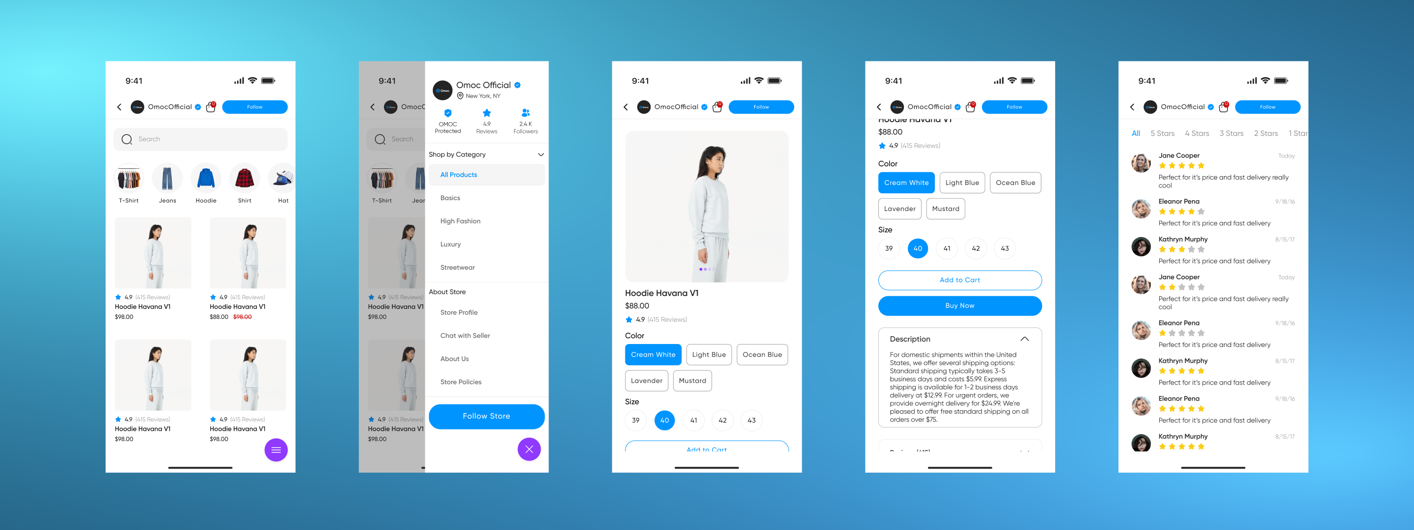
Collaboration, pragmatism, and cross-platform design

Shop & Store Design

I designed the builder AND adapted when engineering said no

Two connected features: how sellers build their shop (desktop) and how buyers experience it as a store (mobile). Designed buyer-side first, then worked backwards to the builder.

BEFORE

No shop building tools for sellers. Buyer store view existed but needed redesign.

AFTER

Full shop builder with form-based editing, redesigned buyer store with categories, product grid, policies. Live preview editing was cut after dev feedback, adapted without losing user value.

How buyers see a seller's shop on mobile

1 / 4

Buyer-facing store template

Designed the buyer-facing store first, looking at what the end result looks like, then worked backwards to what the builder needs to produce

Store template structure (categories, product grid, policies, color/size selectors) came from my research with Claude, inspired by e-commerce UI kits

Original vision included live preview editing; devs said too complex to implement

Adapted: kept live preview for viewing, removed editing in preview. Full-width form + separate preview page. Core user value preserved.

Used expanded/condensed design approach for description, reviews, and store policies sections

WHAT THIS SHOWS

I handle dev constraints without ego. I adapt the design while preserving user value. Whenever developers say something can't be done, I understand and find another way.

REFLECTION

The Growth Arc

Before OMOC, my UX/UI education was YouTube courses and copying Dribbble designs. I could use Figma, but I had no idea how to create components, work within a design system, or think at a platform level.

My biggest skill isn't designing fancy marketing pages. It's systems thinking: attention to detail, thinking about the whole workflow, understanding how pieces connect. The founder confirmed this repeatedly.

I appreciate your attention to detail

— OMOC Founder, said repeatedly throughout the project

FOR JUNIOR DESIGNERS NAVIGATING GROWING SCOPE

Keep learning. Research how others have done it. Use AI not to skip thinking but to think faster; worry about user flows, how users feel, how to solve the real problem instead of wasting time on pixel-level iterations. With practice and continuous learning, you can handle any scope.

Want the full walkthrough?

I can walk you through every screen, every decision, and every pivot. The Figma file has 100+ screens worth of stories.

Next Project

DH

iOS B2B Task Management & Communication